In some ways, an assessment process is a lot like mining. The deeper you dig, the higher the chances of finding things of value. But also, the more effort you’ll need to put into cutting and polishing them into useful and visually attractive assessment reports.
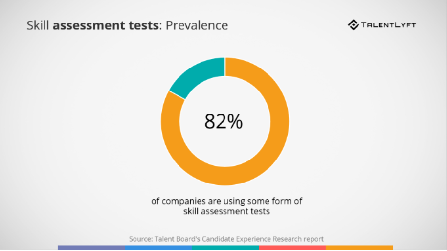
Even before the 2020 pandemic, more than 80% of companies reported having used some form of skills assessment. With remote work as a new standard, one can only imagine digital assessments becoming more prevalent and essential for HR departments and agencies. But how do you polish it into a good-looking, informative report that respondents can use to take action? Let’s dig into a few best practice examples together.
Psst! Want to dive straight into step-by-step tips on how to build your assessment reports? Then click here.
Just so we’re aligned: What is an assessment report?
An assessment evaluates a person or an organization using a series of questions. The answers are used to calculate a score, categorization or another type of outcome that provides value for the respondent.
There are many types of assessments, categorized by industry, objectives, methodology, etc. In this article we’ll be focusing solely on assessment reports, if you’re looking to find the best assessment tool, I highly recommend our guide to select the right assessment tool for your business.
An assessment report will give respondents clear insights into their profile, company, or situation and provide relevant recommendations. And you know what the good news is? The creation of an assessment report can be automated.
How? Well, in a nutshell: Thanks to formulas and calculations behind the preset questions in the assessment. They turn the answers into tangible results, presented in the assessment report in the form of text, numbers, graphs, charts and other representations.
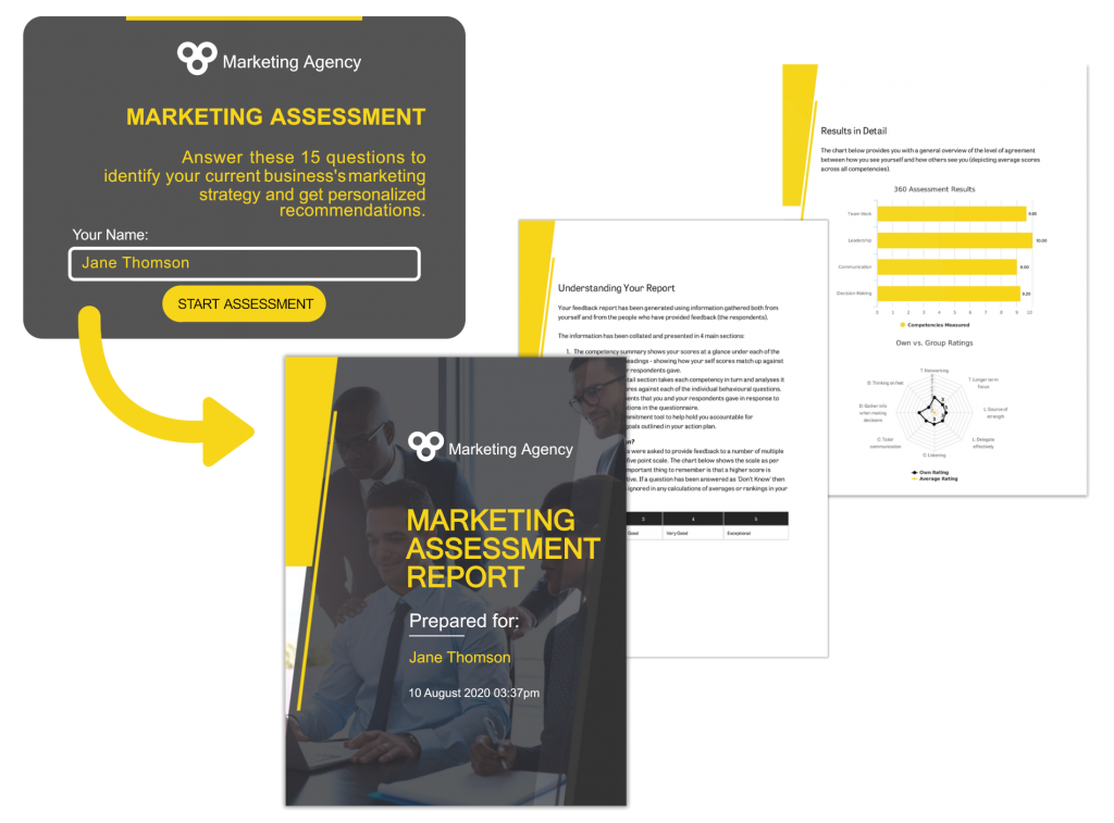
Let’s say you are a marketing consultant asking your client about their current marketing strategy. What are their objectives? Which marketing tools do they currently use? How much do they want to spend on marketing activities such as ads?
Based on their answers, you’ll get a first glance at their situation and be able to map out a strategy that you can present to them by showing them a personalized report, as if it were created especially for them.
Examples of assessment reports
I’ll give you real-life examples to help you get the most out of your assessment report. I will rate every report example in terms of several criteria. Use this checklist to determine for yourself which report suits your purposes best.
Assessment report criteria checklist:
- Design: Is there a front page, a standard header, visuals, …? Are all of these components designed in a coherent structure? Is the report constructed within a clearly defined (branding) style? What about the quality of the visuals? Is the resolution satisfying?
- Introduction: Is the report clear about the objectives? Does it state what the reader can expect to read in the report? What will he/she learn? What method is used? How is the report structured?
- Readability: Is the report easy to read? Is there an optimal balance between text, graphs and visuals? Does the report make use of columns?
- Personalization: To what extent is the feedback personalized? Is the reader addressed by name? Do the results reflect his/her answers? Are personal recommendations included? How are they presented?
- Model/methodology: What methodology is used in the report? Is the methodology applied consequently throughout the report?
- External resources: Does the report link to external sources or benchmarks? Are the respondent’s results compared to industry benchmarks or other reference numbers?
1. The Table Group
Company
The Table Group is a firm dedicated to making companies more successful and making work more fulfilling.
Assessment report
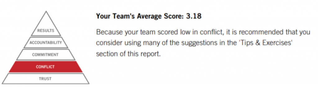
The primary purpose of this team assessment report is to provide your team with a sense of its strengths and areas for improvement. While the assessment itself is certainly quantitative and data-driven, its most important aspect is the qualitative perspective it provides for the assessed team and the discussion that it provokes around specific issues.
Rating
⭐⭐⭐
Key strengths and weaknesses
🟢 Introduction: This report gives the respondents a clear understanding of what they may expect to read and learn thanks to the introduction and explanation of the used model.
The Table Group kicks off the report by presenting a summary of the findings, before going into more detail. This is a strong way to encourage the team to read on and discover why the results are the way they are.
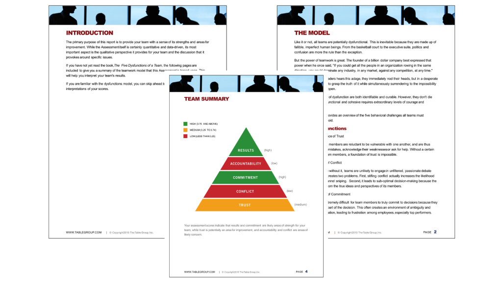
🟠 Readability: The balance between text and visuals on the first pages leans towards text heaviness. Images, graphics and examples could bring solace to the reader.
The same problem occurs later on in the report, where the results are discussed in more detail. It would be more illustrative to the reader if the variables in the result tables are presented in the form of charts. This improves the comparability of the different areas.
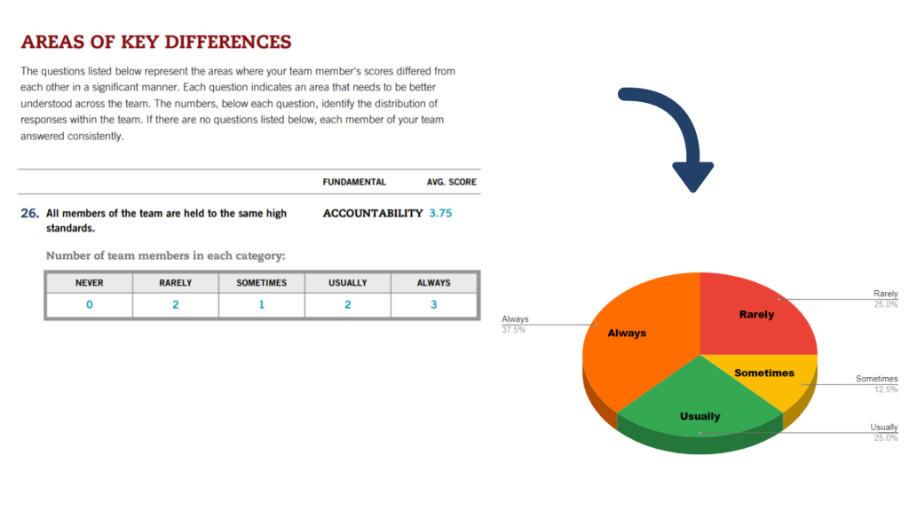
For example, the table “Areas of Key Differences” could be accompanied by a pie chart. These charts are used to represent the composition of an entity or group—in this case, the team and the different answers of the team members.
For feedback, the report refers in each category to the “Tips and Exercises” section. Including practical tips is useful, but it grabs more attention when presented within each category, not in a different section further on in the report.
2. Atlas Point
Company
Atlas Point helps financial advisors and individual investors have better financial conversations with their clients.
Assessment report
To deliver financial advice at scale, Atlas Point digitized financial virtues assessments. Each report is tailored based on the response that each individual gives to the tool.
Rating
⭐⭐⭐⭐
Key strengths and weaknesses
🟢 Personalization: On the cover page, both the advisor and the respondent/client are mentioned. As formulated above, Atlas Point also generates two different reports from one assessment: one for the client and one for the advisor.
🟢 Design / Readability: There is a clear use of symbols and colors, which benefits the structure of the report. The reader will be able to navigate through the report easily.
🟠 Introduction: The report jumps right into the insights, without telling you what you may expect as a reader or giving an overview of the possible outcomes. This is not a problem for the advisor, who should know the content of the report, but the client might be interested to read what they may expect to learn throughout the report.
Note: Atlas Point has addressed this concern by providing general information inline, which makes up for it largely.
3. Indaba Global
Company
Indaba Global is a training and development company providing products and services in the management consulting field. They provide professional coaching for executives.
Assessment report
To help businesses, colleges and consultants to assess an individual’s behavioral tendencies, they have developed their own behavior assessment (DISCflex). This assessment comes with a DISC Assessment report.
Rating
⭐⭐⭐
Key strengths and weaknesses
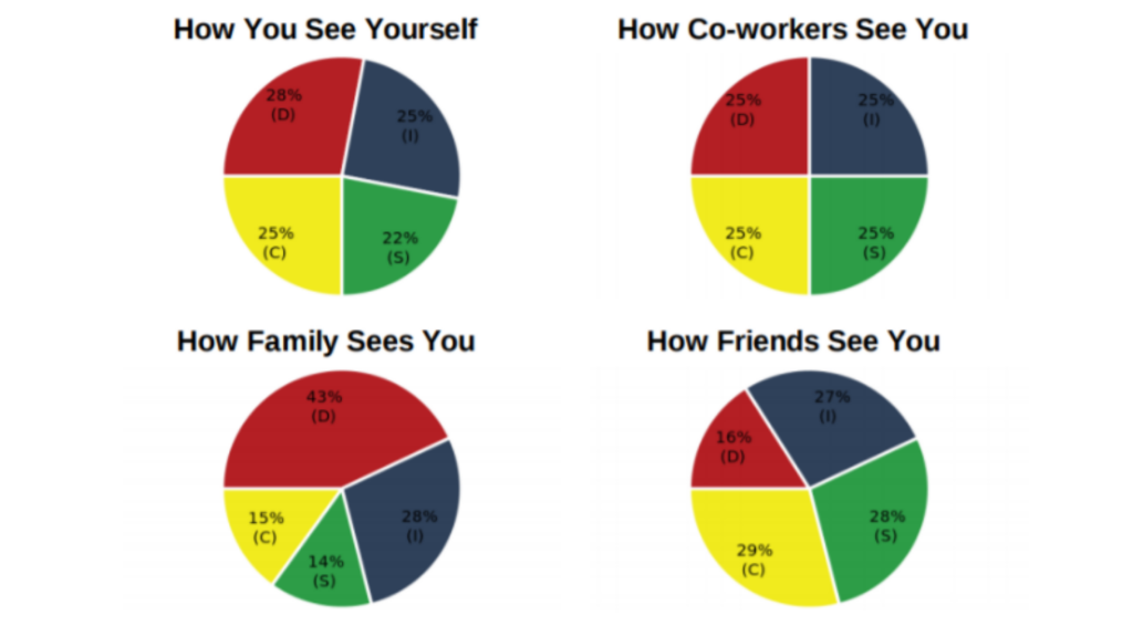
🟢 External resources: In their methodology, Indaba uses third party feedback to compare the respondent’s results to how others (co-workers, family and friends) see them. This is a very good approach to encourage deep introspection.
🟠 Personalization: We can speak of clear customization based on the answers of the respondent. But apart from that there is little to no personalization, like the use of the respondent’s name.
🟠 Readability: Even though there are some very useful chart visualizations, Indaba also provides a lot of text-based information. In my opinion, we’re slightly tilting towards a bit of information overload. Consequently, the reader might lose interest. Also, the report uses a small font which has a negative influence on the readability.
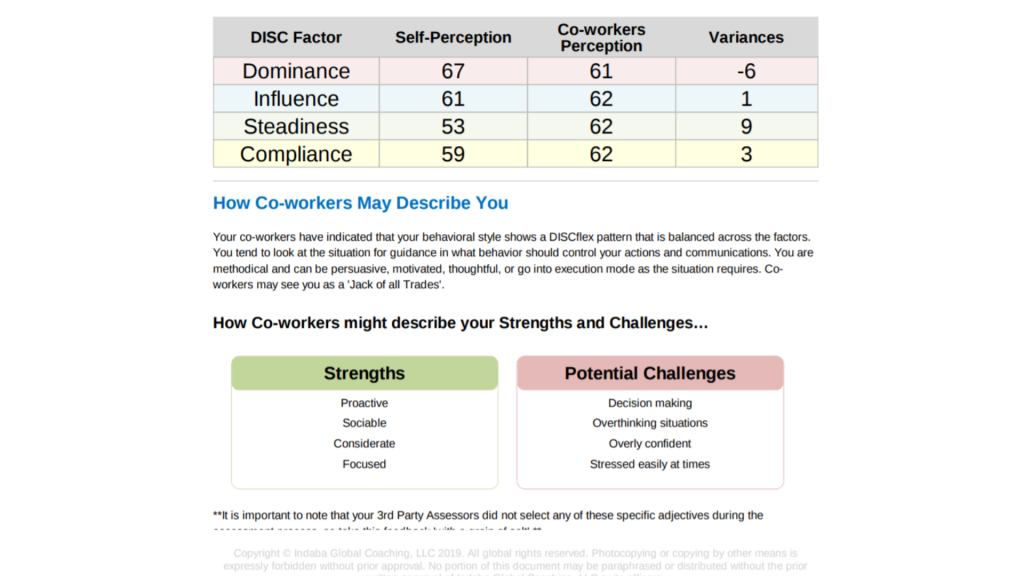
Make sure that, when you generate a PDF assessment report with variable text (i.e. text that varies according to the answers the respondent gave in the assessment), you take the presence of headers and footers into account. As you can see above, a part of the text disappears beyond the footer.
Want to put into practice some of these takeaways? Check out how to go about creating your DISC assessment with Pointerpro here.
🔴 Design: The design of the report is very basic. It would look more professional if more attention was paid to the corporate identity. Consider utilizing graphic design tools to enhance your visual appeal and effortlessly create a more polished presentation.
4. BDC
Company
BDC is a Canadian business development bank. It’s a financial institution devoted exclusively to entrepreneurs. They help create and develop Canadian businesses through financing, consulting services and securitization, with a focus on small and medium-sized enterprises.
Assessment report
BDC created a digital maturity assessment to find out where the respondent’s business stands. The maturity assessment report shows how they compare with their industry peers, as well as to identify areas for improvement.
Rating
⭐⭐⭐
Strengths and weaknesses
🟢 Readability: It reads easily, giving the respondent the opportunity to grasp the essence of his or her results.
🟢 External resources: BDC applies a comparative model, allowing the respondents to compare their results with industry benchmarks.
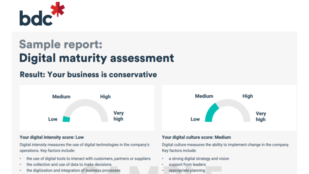
🟠 Introduction: If we look at the structure, we see no clear introduction. BDC immediately jumps into the results. Is this a problem? In this particular case, not necessarily. The results are accompanied by charts and contextual information, enabling the respondents to see their results in a bigger picture.
🟠 Design: The report is nicely designed, with a clear representation of their corporate identity. Unfortunately, there is no cover page. A cover page gives the report a more professional appearance in the eyes of the respondent.
🔴 Personalization: The report is relatively short and the recommendations they share with the respondent are only personalized to a minimal extent. All insights are linked to the profile “conservative”, in this case, and the report doesn’t dig deeper into the separate answers given by the respondent.
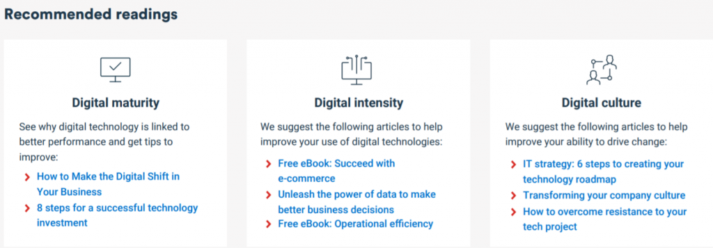
Also the recommended reading is too general and, consequently, not engaging.
Thinking of developing your own maturity assessment(s)? Then give this page a read.
A step-by-step guide to create an assessment report yourself
The ideal structure of an assessment report depends on different factors. Let’s take a look at this example:
1. Use a cover page
- Start your assessment report with a cover page that clearly represents your brand and addresses the respondent.
- Make sure the cover page looks professional and attractive, suitable for your industry.
- Represent your brand by incorporating your branding color(s), font, logo, and style.

2. Explain what the respondent will encounter in the report
- Talk to the respondent as if you are having a real-life conversation.
- Explain the objective.
- Elaborate on the structure of the report.
- Use symbols to indicate the different sections of the report.
- Be transparent about the method you used to come up with the results and insights.
3. Provide a summary of the findings
- Show the overall results of the respondent before you go more into detail in each separate section.
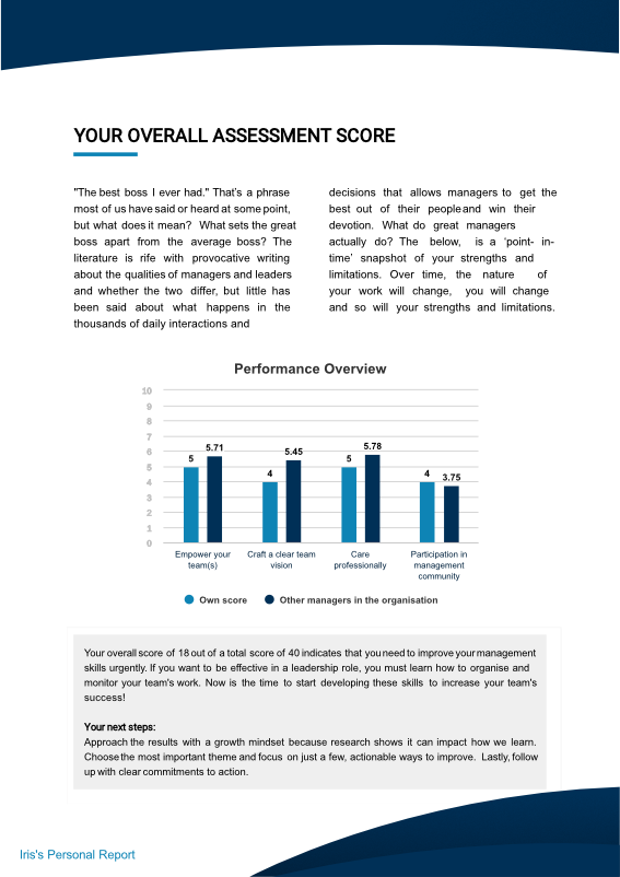
- Represent the results in a clear chart. A column chart is useful to show several results in one view.
- Let respondents take a look at their results overview, followed by personalized recommendations based on their scores. This will help the reader in preparing for the detailed discussion of the separate themes later in the report.
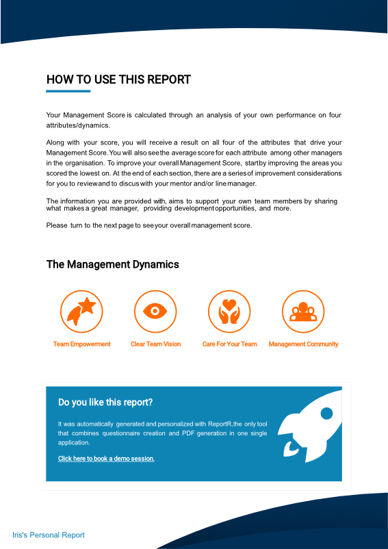
4. Discuss each theme separately
Show the respondents per theme how they scored, and what this means for them:
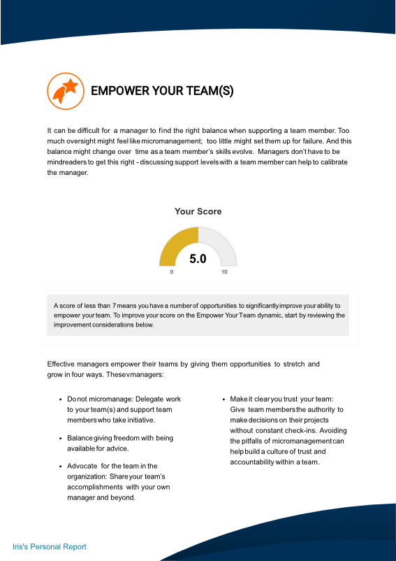
- Use a symbol or visual to clearly identify the different themes.
- Include custom scoring and visualize the personal score of the respondent with a gauge. You can use other charts as well, especially if you like to show how the respondent compares to peers, an industry average, etc. For the latter, you can use a bar chart.
- Make personalized recommendations based on the scoring of the respondent.
You can end the report with a short conclusion, a call-to-action, or general information about your company.
Conclusion: How to stand out from other assessment reports
There are many factors that determine the quality of an assessment report. If I did have to highlight what many agencies or organizations tend to look over, I’d mention these two:
- Personalize your assessment report: Use the name of your respondent throughout the report. You can do that in the header, footer, in text-based blocks, or in chart titles. Include personalized feedback per aspect you’re discussing.
- Make your assessment report visual: Balance out text and visuals. Why explain results in text-form when you can present them in easy-to-digest charts or tables? Don’t forget your design: take your corporate identity into account, use your house font and colors.
It’s important to note that there is not one “ideal model” that can be applied to every assessment report. If you’re planning on developing your own assessment reports and haven’t decided on a tool yet, be sure to give Pointerpro a try.
If you’re interested in auto-generating, assessment reports that are personalized, well-designed and branded, we’ll happily get in touch to get you started.


One Response
USEFUL INFORMATION.
THANKS A LOT